Designing an Icon Set
Recently I had the opportunity to design an icon set, which will be used to indicate different sections or categories on a website. Outlined below is a brief summary of the process for this particular project.
Initial Sketches
During the first phase multiple ideas were sketched for every icon. Key ideas were refined and then shared with the client in order to determine the best representation. Below you can find a composite of thumbnail sketches, which is just a small sample from my sketchbook.
Digital Mockups
Next, I presented a number of digital mockups which were based on two key icons from the ideation phase. The choices varied and incorporated qualities of the existing brand. Included were black and white and full color options. Even large and small versions were presented to show how the icons would scale up or down. The purpose here was to give the client a few options and to pick one they felt worked best. A couple of these mockups can be seen below.
Final Icons
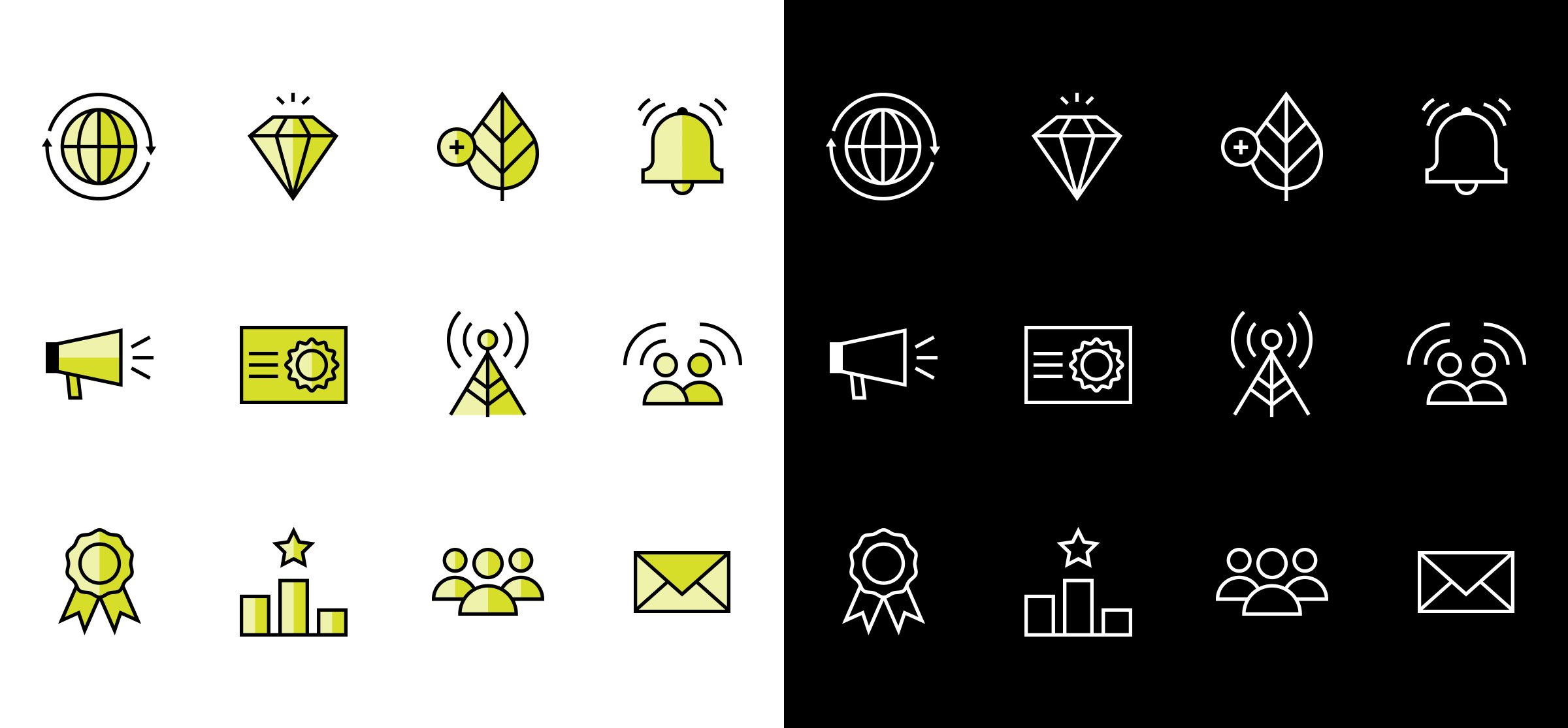
Based on their final selection I built out the remaining icons. The result is a traditional yet minimal suite of icons that ultimately paired with the client’s website and brand.


