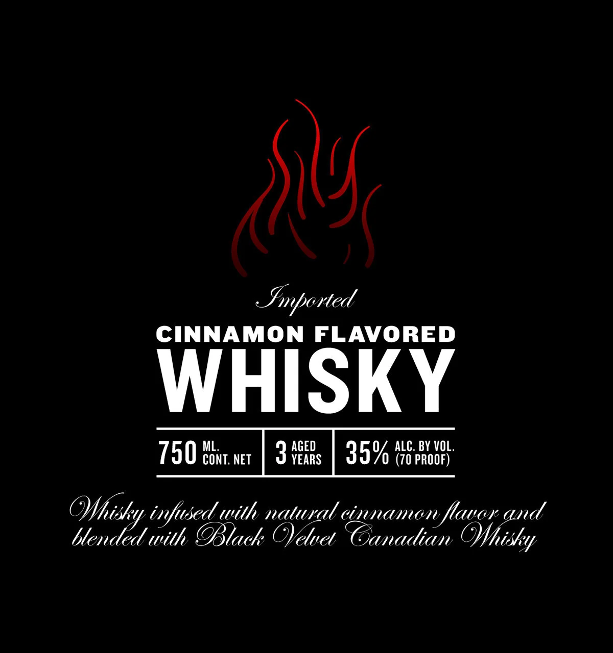
Label design for a whisky brand.
Overview
I was asked to design a label for a new whisky flavor. The two primary goals were to appeal to a younger audience and establish brand recognition.
Heritage Design
The first option was inspired by tradition and heritage. Using hand crafted typography and illustrated banners I was able to tap into the spirit of a younger crowd. To establish brand recognition and familiarity I developed a checkered pattern that was based on the original Black Velvet logo.
Modern Approach
The second option was a modern take on the label. A prominent and stylized hand drawn lockup was used for the flavor name, which was to be printed on a clear label that wrapped around the entire bottle.
Project Info
Services: Art Direction and Typography.
Client: Black Velvet Whisky. Work done at BRIGADE.


